













Midnight Navy
Our base. Backgrounds, lettering and body text.
- HEX
- RGB
- HSB
- CMYK
- Pantone

Brand guide
Our logo
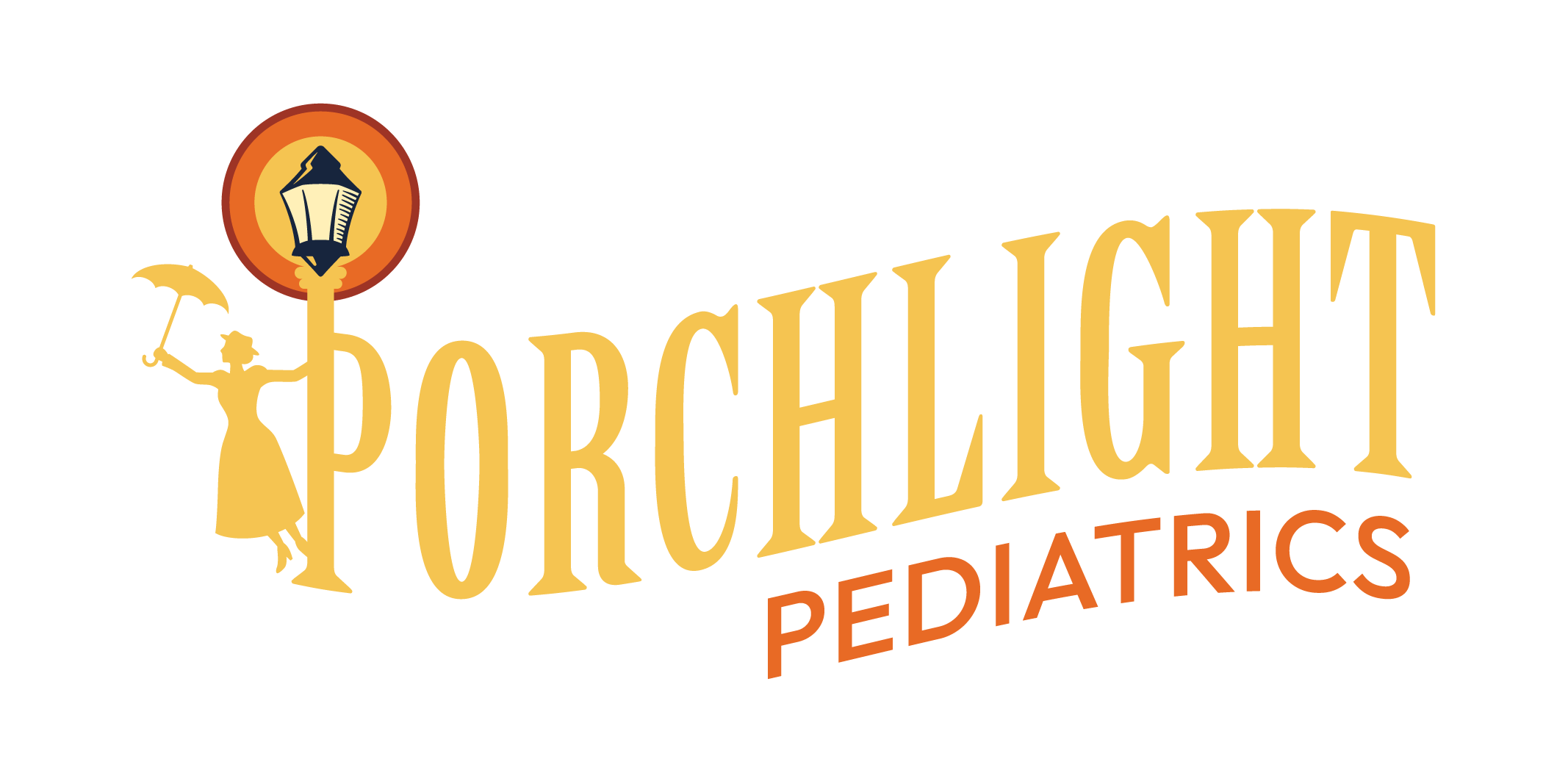
We are very proud of our logo. Follow these guidelines to ensure it always looks its best. Our logo is the combination of a glowing lamppost with a caregiver arriving, umbrella in hand, and tall storybook lettering, for a look that is warm, storybook and trustworthy.
Our logo can be used in the following three (3) styles:
Our main horizontal logo is the full version of our logo. Use it first, anywhere people may be meeting Porchlight Pediatrics for the first time.

For white and light backgrounds.

For navy and dark backgrounds.

One color, when color can't be printed.

One color, on dark or colored backgrounds.
Use this version where there is room for our promise, Care That Comes Home, such as the website, printed pieces and signs. It is not for small sizes.

For white and light backgrounds.
For navy and dark backgrounds.

One color, when color can't be printed.

One color, on dark or colored backgrounds.
Use the icon in small spaces where the Porchlight Pediatrics name would be too small to read, such as a social profile picture or a website tab.

For any background. The JPG is square on Porch Cream, ready for a profile picture.
The same icon on Midnight Navy. The JPG is square, ready for a profile picture.

One color, on white and light backgrounds. The JPG is square on white.

One color, on dark or colored backgrounds. The JPG is square on Midnight Navy.
Backgrounds
The full-color logo is for white and light backgrounds. On dark or colored backgrounds, use the dark-background or white version. These are the preferred background colors.
Wireframe
Every piece has a job. Together they tell one story: the porch light is on, and care is on its way.
Exclusion zone
Keep clear space on every side of the logo equal to half the width of the glowing circle around the lantern. For the icon, keep clear space equal to one quarter of the icon's width. Nothing else enters this space: no text, photos or page edges.
Minimum size
Below these sizes the details fill in and the name gets hard to read. If the space is smaller than the main logo's minimum, switch to the icon.
Logo misuse
The logo should always look the same. Don't change it, add to it or rearrange it.
Our tagline
Our colors
This primary palette should be used on all branded materials. These colors are the foundation of our brand: a porch light glowing against a midnight sky.
Our base. Backgrounds, lettering and body text.
The light. Lettering on navy and warm backgrounds.
Soft backgrounds and text on navy.
The pop. Pediatrics, buttons and small accents.
A deep accent. Use the least.
A rough balance to aim for. Navy and the light tones carry the page. Orange and rust are accents, so a little goes a long way.
Use these pairs for text. Each one has been checked so the words are easy to read.
Good for any text
Headlines and large text only
Avoid for text: Lantern Orange on Porch Cream, Golden Glow on White. They are too close in brightness to read comfortably.
Our fonts
Two fonts make up the Porchlight Pediatrics look: one with character for our name, and one clean and friendly for everything else.
The tall storybook lettering in our name. Use it for big headlines only, always in capitals, and never for paragraphs.
Available from Adobe Fonts.
Our everyday font, used for Pediatrics and the tagline in our logo. Use it for sub-headlines, paragraphs, buttons and captions.
Free from Google Fonts. This guide is set in Outfit.
CapitalsABCDEFGHIJKLMNOPQRSTUVWXYZ
Lowercaseabcdefghijklmnopqrstuvwxyz
Numbers and symbols0123456789 & ! ? @ # $ % ( ) + . ,
Medium, as in our logoCare That Comes Home
BoldCare That Comes Home
How a headline, label and paragraph look together in Outfit.
Home visits
The porch light is on. We'll come to you.
Paragraphs are set in Outfit Regular in Midnight Navy, with comfortable space between the lines so they are easy to read on a phone.
Which file to use
Every file is in the brand package. When someone asks for "the logo", this is what to send.
SVG or PNGJPG. It is square with its background built in.PDF or EPS. Printers prefer these.SVG or PNGPDF or EPS for the embroidery shopPDF or EPSSVG or PDF for print, PNG for screensPDF or SVG or PNGThe lantern has fine lines that can fill in with thread. For embroidery, use a one-color version in a single thread color, keep the main logo at least 3.5 in (90 mm) wide, and use the icon by itself on anything smaller, like a hat or a sleeve. Ask the shop for a stitched sample before a full order.
QR code
Scanning it opens our website, porchlightpeds.com. Use it on business cards, flyers, magnets and signs so families can find us in one tap.

The one to use first, on white or light backgrounds.

For one-color printing.

Only when it has to sit on navy. Some older phones read it less easily.
Thank you
If you have trouble with anything in this guide, are missing files from your brand package, or aren't sure a piece fits the Porchlight Pediatrics brand, text bahlr at 208.966.2400.



Social media
Placing the logo on social media
Use the icon as the profile picture and the dark-background logo in the banner. Ensure the logo has space on all sides.